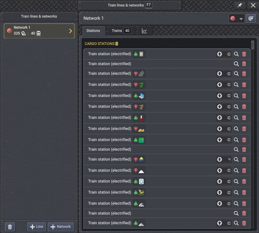
Suggestion for Game UI Optimization - Relocating the "Add" Buttons
I would like to suggest moving the buttons for adding train stations, gas stations, and rest areas to a unified and fixed location at the top of the train network interface. Currently, as the number of stations and rest areas grows, players have to scroll all the way to the bottom of the screen to find these "Add" buttons. The larger the network becomes, the more pages we have to scroll through, making the process of expanding the network increasingly tedious and inconvenient. Placing these buttons at the top would significantly improve the user experience.
Additionally, it would be extremely helpful to introduce a sorting feature for the station list. For example, allowing players to sort or categorize stations based on the types of products they import or export. This would greatly enhance network management efficiency as the game progresses.