Commander-in-Chief! Hello! :)
A few interface change requests.
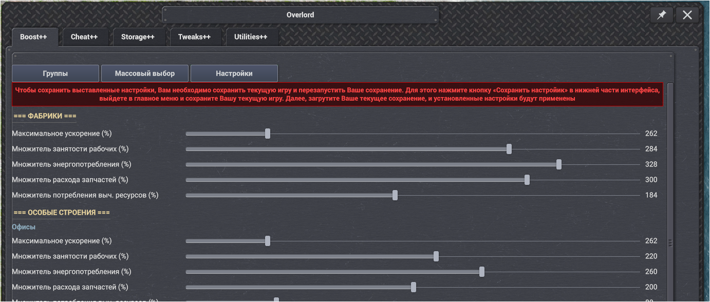
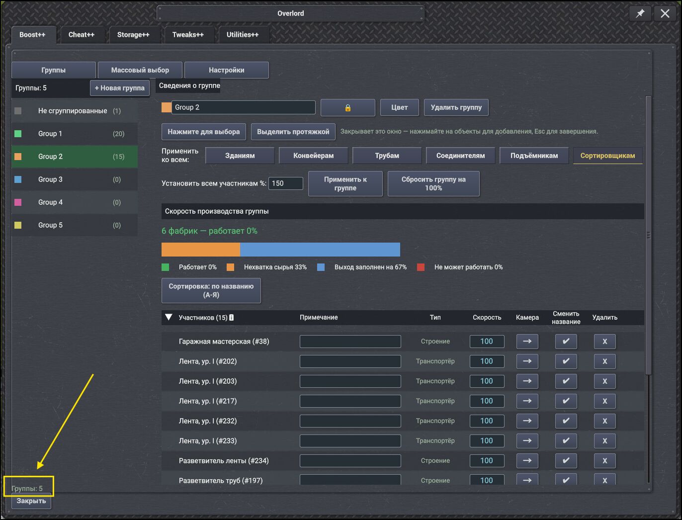
Let's separate the lines from each other a bit. Right now they blend together and don't look very "presentable." They could simply be separated by a line or a horizontal divider, which would look much better — especially since the main menu opens on the 3rd line, it should turn out great.
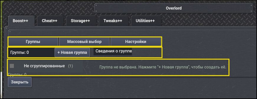
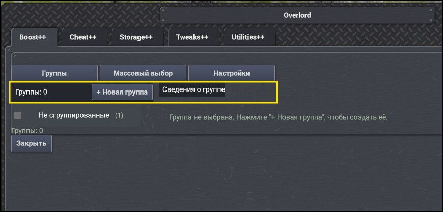
This block should ideally be aligned the same way as the top line, so they have a "unified look." That is, they need to be centered a bit.
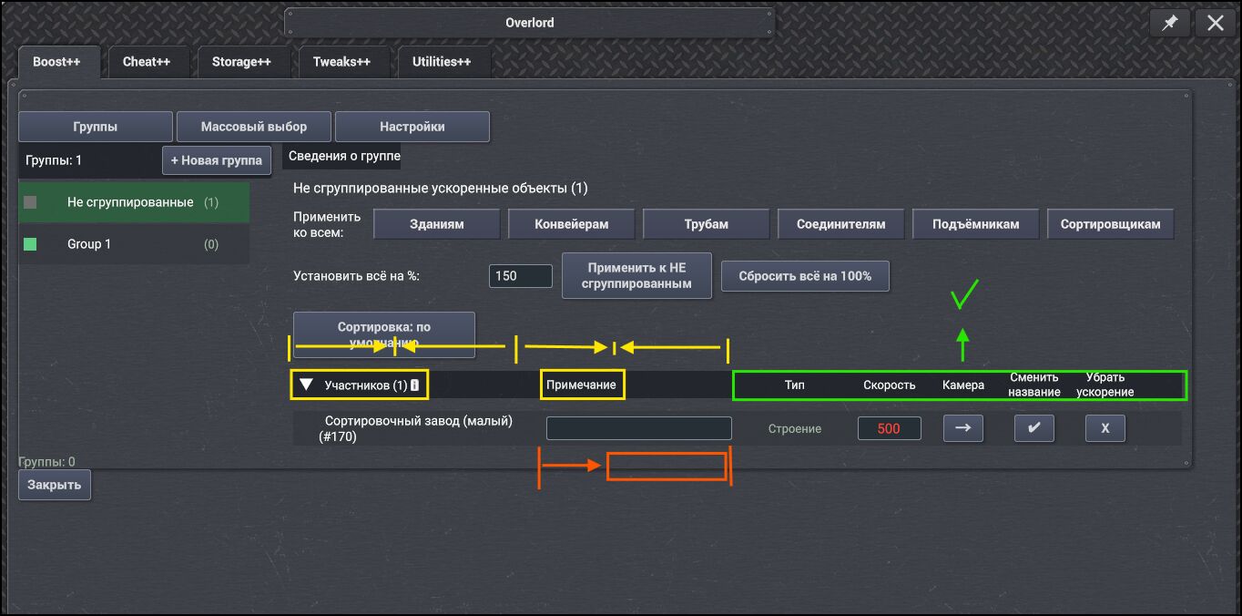
The headers "Members" and "Comment" need to be centered, just like the other headers. At the same time, it would be good to shorten the "Comment" column a bit — this would allow building names in different languages to fit in a row (for the most part). And I suspect that users don't add notes to buildings all that often, so shortening the column probably won't have any negative consequences.
These buttons are missing tooltips that explain their purpose.
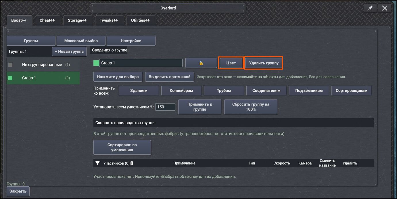
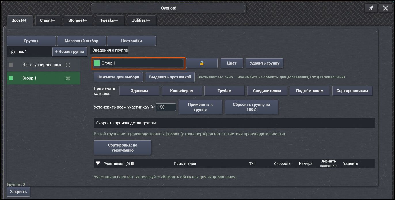
Add a tooltip about the ability to rename the group.
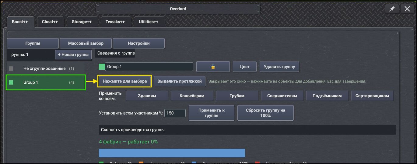
Info message for these options.
"Highlight object / highlight objects by area" — currently they appear on a black background at the top of the game screen, which isn't convenient — they kind of get lost. If possible, it would be better to move this message under the mouse cursor. It could be made adaptive (stretching relative to the text), but if necessary, in localizations you can simply specify line breaks, and it will adapt and shrink to fit the text width.Regarding the interaction of the function itself — currently, selection can only be canceled with the "Escape" key. It would be good to also add the right mouse button for cancellation, so we'd have two keys: "Escape" and "right mouse click."
Regarding the area selection tool:
Currently, when selecting buildings by area, the buildings that fall within the selection are not highlighted, so the user cannot visually determine which buildings have been added and which haven't.
This can only be seen after the user finishes the selection and then re-enters the function — only then do the selected buildings become highlighted in "green."
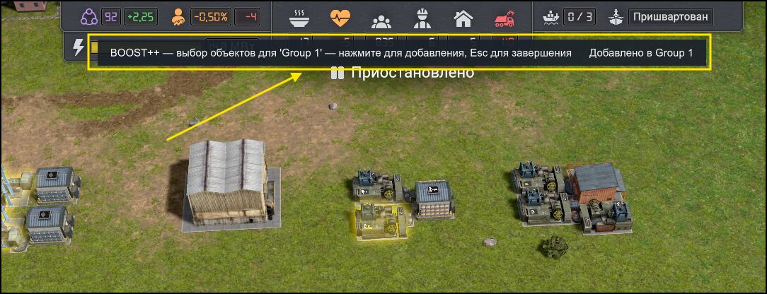
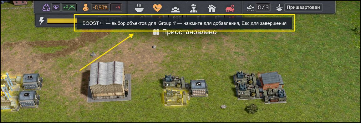
Note that there are 2 different messages there.
In general, you could make a single function where, when a user single-clicks on an object, it gets added to the selected group. But if they hold down the "Shift" modifier key, it activates the area selection tool, allowing the user to add buildings by dragging a selection box.Separation of functionality for different actions.
It would be better to separate these different functions with a horizontal line, as is done in other mods — essentially dividing the sections. This would look more correct.
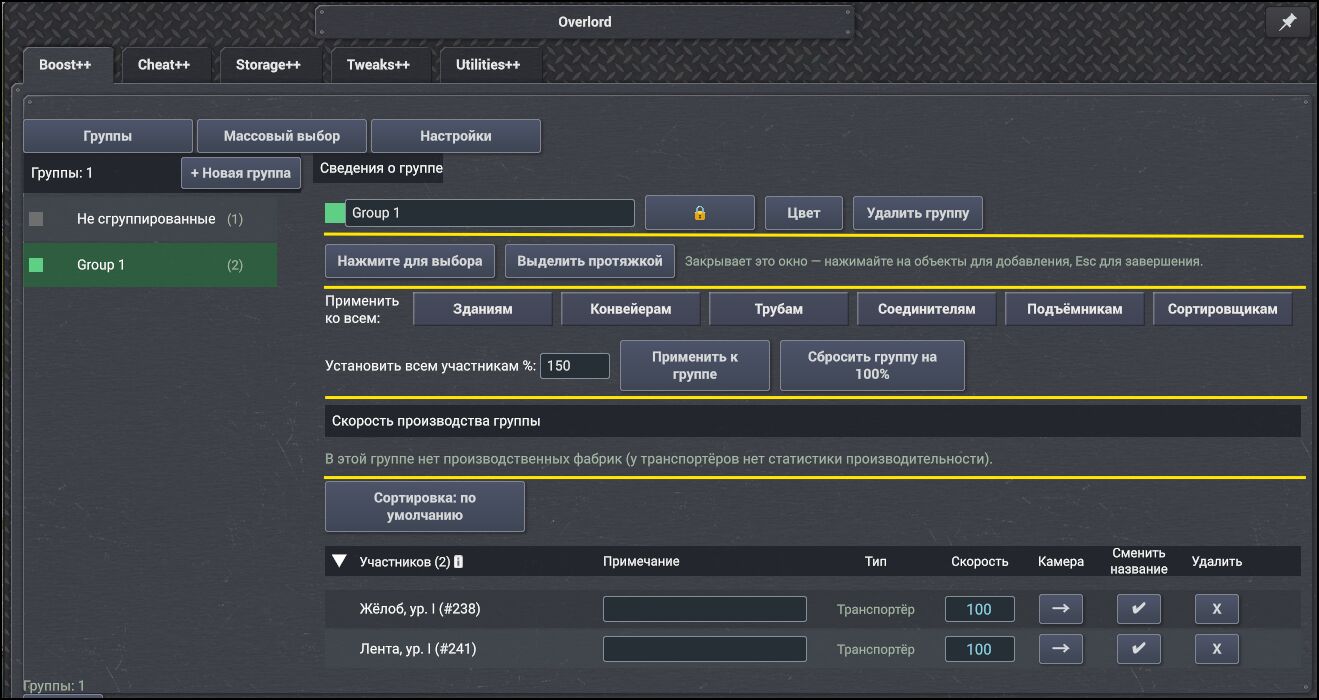
This function doesn't have a tooltip explaining what it does — it would be good to add one.
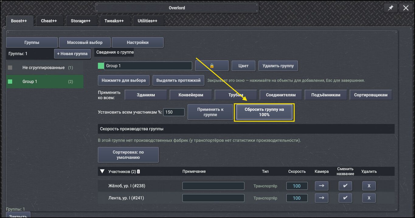
It would probably be better to extend the "bar" to the end of the line — that would look more complete and natural.
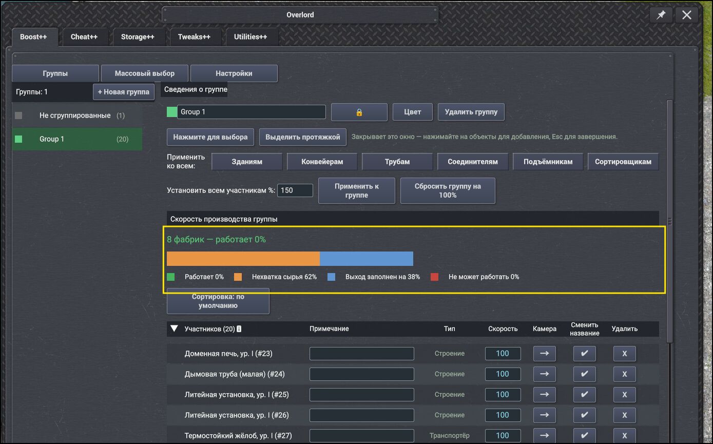
Info message about the number of groups: it only updates when a group is added by selecting any object, not when the group itself is added. There's likely some filter that counts "active" objects in the group — if there are any, the counter triggers. But it would probably make more sense to count the number of added groups, not just those that have objects in them.
Regarding this info message itself... either it's not needed at all, or it would be better to move it somewhere higher — for example, split it into "ungrouped objects" and "groups," and place this message as a header for the groups section.
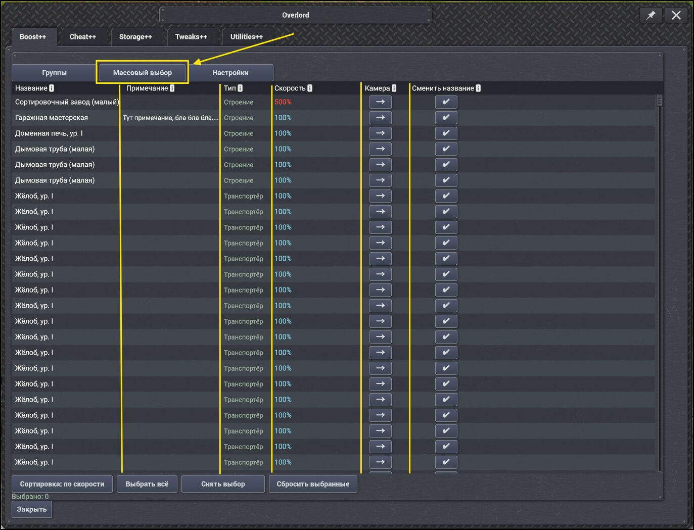
"Mass selection" tool.
The table itself really needs to be optimized — or rather, some columns should be shifted to the right. For example, give the object name column a wider field. Center the "type" and "speed" columns (as well as their headers).
Overall, if you shift them to the right, it would look great (and there would be more room for object names).
Also, the column headers need to be centered: "Name" / "Type" / "Speed". The values in the "Type" and "Speed" columns also need to be centered.
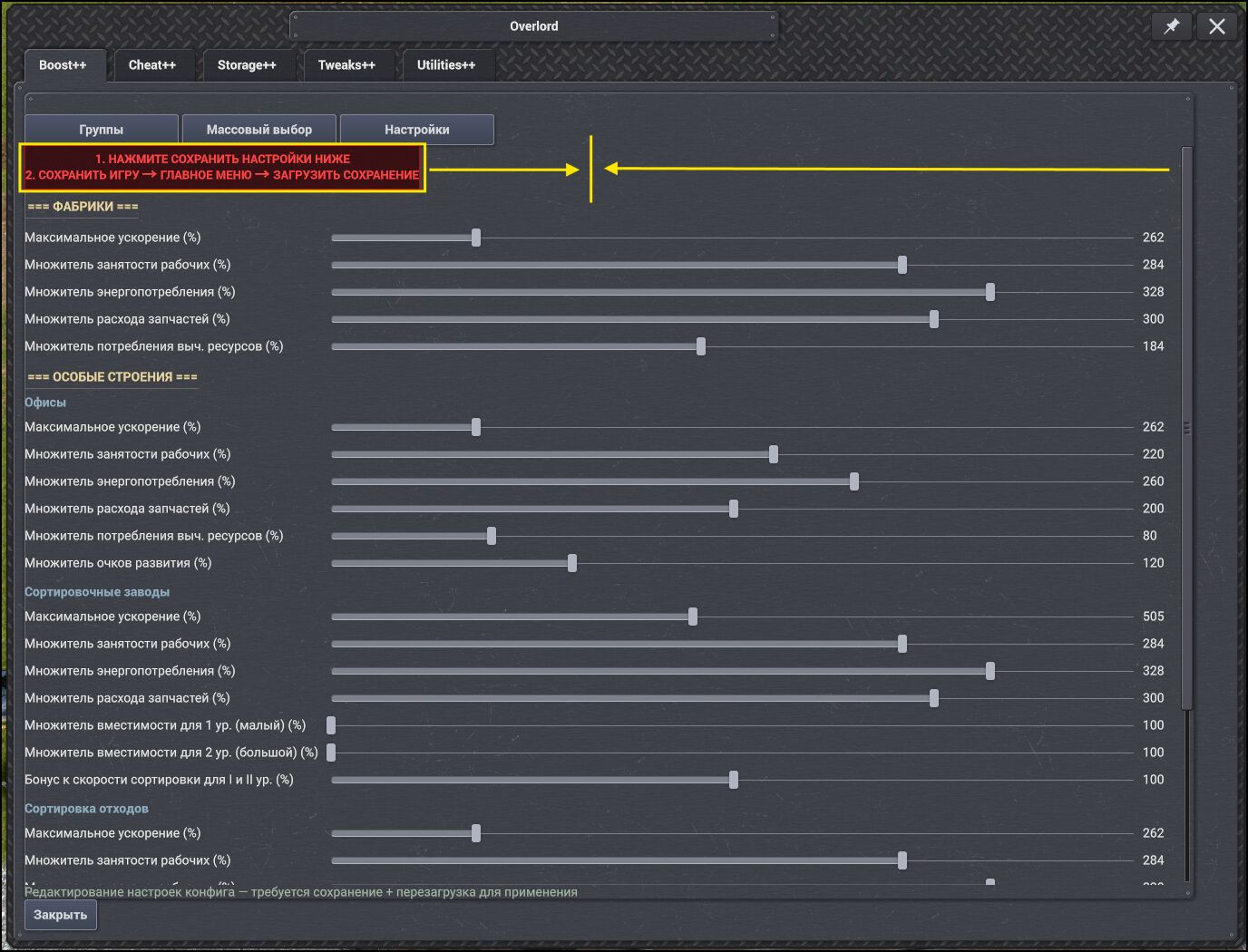
Info message for the user.
It needs to be centered.
Separate the sections with horizontal dividers, and also center the headers if possible.As for the values themselves — on one hand, everything seems clear, but on the other hand, there's some confusion. For example, when setting the maximum speed value, I can't set it exactly to "300%" — it only lets me set either 298 or 307. This is probably due to some step increment, but it's not very clear for the user. It would be good to fix this and synchronize it with the settings that can be set for buildings.
And if we're going all out, you could add a manual input field for the value, so the user can set the exact value they need.
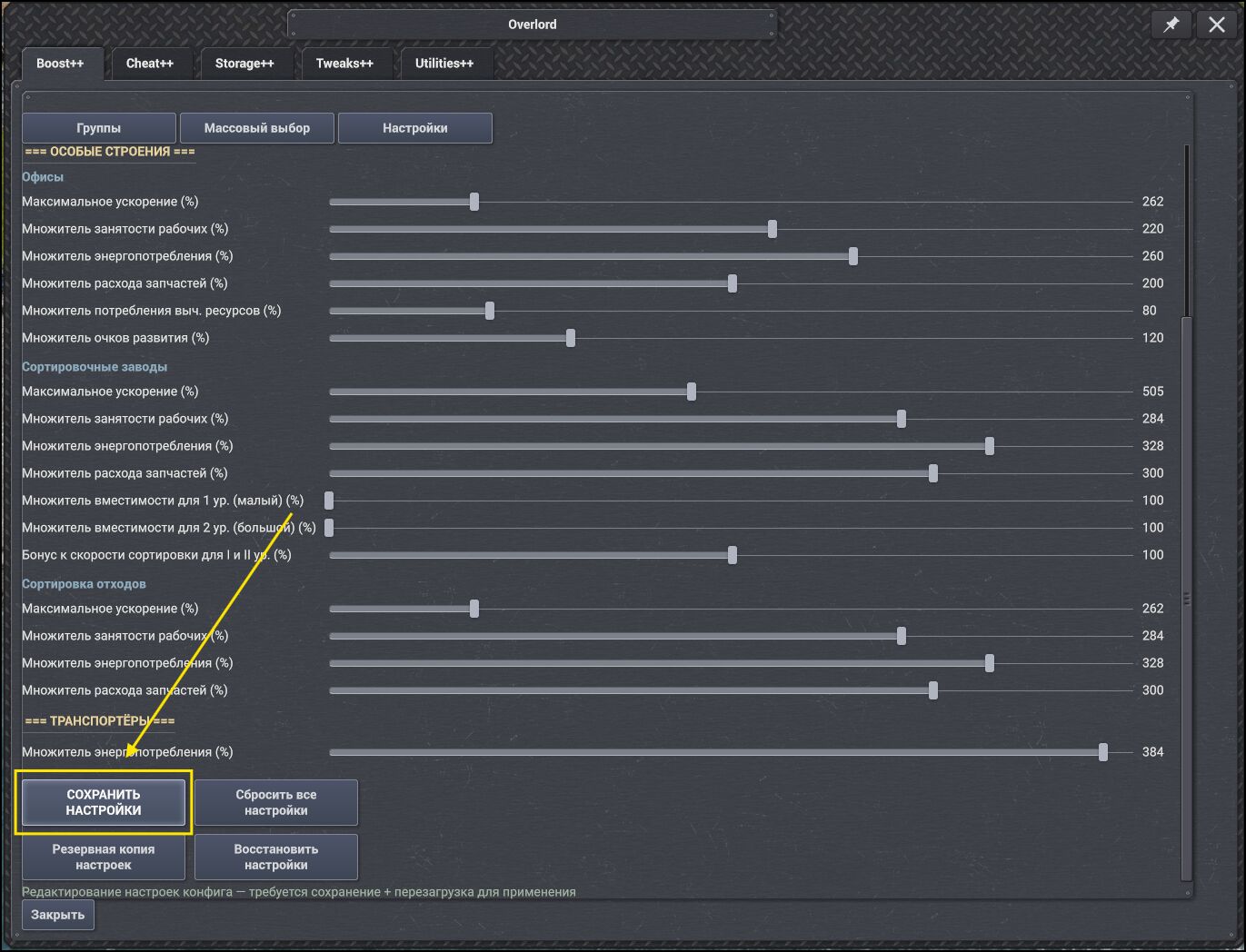
There's no tooltip indicating that saving the current settings is only available for the current save.
This section is dedicated to you — your perseverance, professionalism, desire to make things better, inexhaustible optimism, sense of humor (especially in the configs), responsiveness to current issues, willingness to engage, and, most likely, just being a wonderful person!
Thank you for your work, for making this world a little bit better (by creating content for games), for listening to the community, and for your willingness to "indulge" it.
In short, thanks for the mods — I admire you and your perseverance!